Tips
Tips
Jul 26, 2025
Jul 26, 2025
Designing for Responsiveness in Framer
Designing for Responsiveness in Framer
Designing for Responsiveness in Framer
Introduction
A website that looks great on a desktop but breaks on mobile is a website that’s losing visitors and credibility. In today’s world, where over half of web traffic comes from mobile devices, responsive design isn’t optional—it’s essential.
Framer makes building responsive sites easier with its layout tools and flexible structure, but it requires intentional design choices to ensure your site looks and functions beautifully on every screen. In this post, you’ll learn practical steps to design and build responsive websites in Framer without compromising your creative vision.
Why Responsiveness Matters
Users expect seamless experiences regardless of whether they’re on a phone, tablet, or large desktop monitor. A site that requires pinching, zooming, or excessive scrolling will frustrate visitors, leading to higher bounce rates and lower engagement.
Beyond user experience, search engines prioritize mobile-friendly sites, impacting your discoverability and ranking. Designing responsively ensures your Framer site performs well for users and search engines alike.
Start with a Mobile-First Mindset
Designing with mobile screens in mind from the beginning helps you focus on essential content and clear structure. Consider:
Prioritizing key information and CTAs at the top of your mobile layout.
Using readable font sizes and sufficient padding for tap targets.
Keeping layouts clean and uncluttered to prevent overwhelm on small screens.
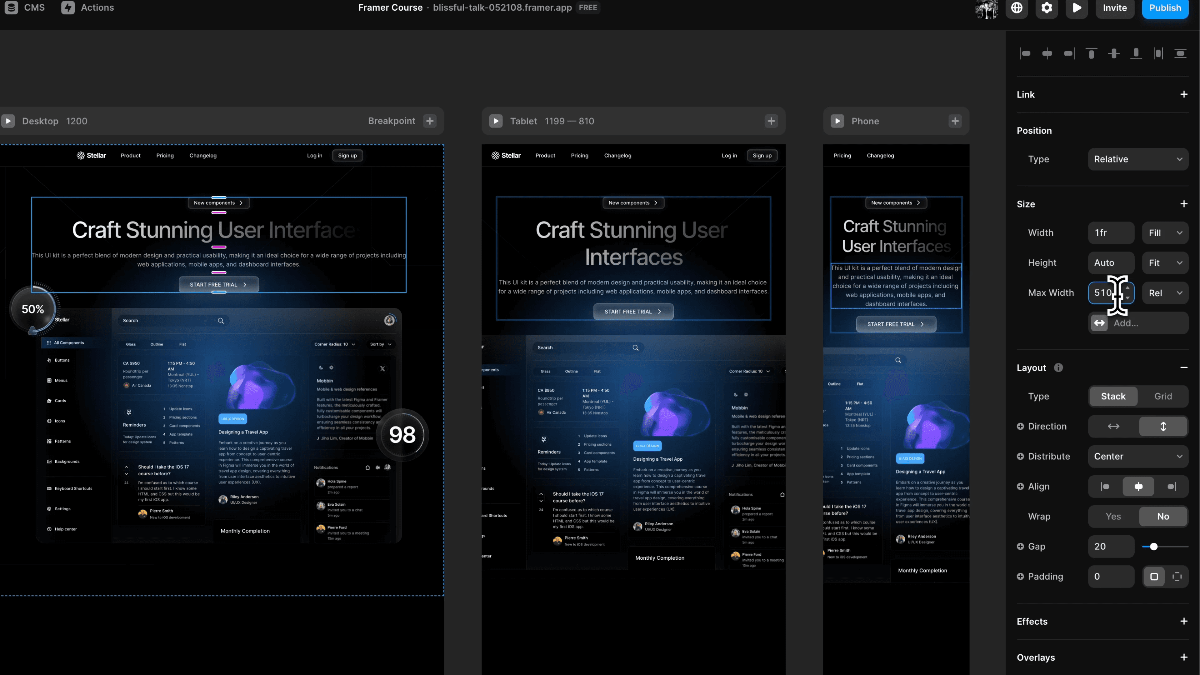
Framer’s breakpoints allow you to start with a base layout and progressively enhance it for larger screens, maintaining consistency while adding complexity where it makes sense.
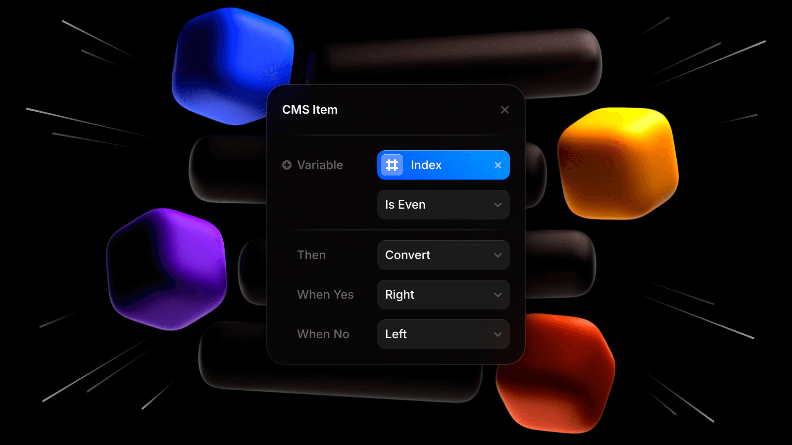
Use Flexible Layouts and Constraints
Framer’s layout tools are powerful for creating adaptive designs. To build responsive sections:
Utilize auto-layout and stack components for elements that need to adjust across screen sizes.
Set flexible width and height constraints to allow elements to resize naturally.
Use relative positioning to align elements dynamically instead of relying solely on pixel-based layouts.
Testing these layouts during the build ensures your design adapts fluidly across different devices.
Plan for Image and Media Responsiveness
Large hero images or section visuals can look stunning on desktop but may slow down mobile load times or display poorly on smaller screens. To optimize:
Use images that scale proportionally without losing focus on key subjects.
Employ Framer’s image fill settings to adjust cropping dynamically.
Consider hiding or replacing heavy background videos or animations on mobile with lighter alternatives.
This ensures visual impact without sacrificing usability or speed on mobile devices.
Simplify Navigation for Mobile Users
Complex desktop navigation menus may not translate well to smaller screens. In Framer, consider:
Using a clear, accessible hamburger menu for mobile navigation.
Prioritizing essential links to keep menus simple and user-friendly.
Ensuring navigation elements remain easy to tap without accidental clicks.
Smooth, intuitive navigation improves user experience and keeps visitors engaged across devices.
Test Across Devices Regularly
Responsive design isn’t a one-time task. Throughout your Framer build, test your site on multiple devices, including:
Mobile phones (various sizes and operating systems).
Tablets.
Different desktop screen sizes.
Framer’s preview and device simulator help, but real-device testing ensures your animations, layouts, and interactions feel right in context.
Conclusion
A responsive site isn’t just about fitting content onto smaller screens—it’s about delivering a seamless, user-centered experience that adapts gracefully to every device your visitors use.
Introduction
A website that looks great on a desktop but breaks on mobile is a website that’s losing visitors and credibility. In today’s world, where over half of web traffic comes from mobile devices, responsive design isn’t optional—it’s essential.
Framer makes building responsive sites easier with its layout tools and flexible structure, but it requires intentional design choices to ensure your site looks and functions beautifully on every screen. In this post, you’ll learn practical steps to design and build responsive websites in Framer without compromising your creative vision.
Why Responsiveness Matters
Users expect seamless experiences regardless of whether they’re on a phone, tablet, or large desktop monitor. A site that requires pinching, zooming, or excessive scrolling will frustrate visitors, leading to higher bounce rates and lower engagement.
Beyond user experience, search engines prioritize mobile-friendly sites, impacting your discoverability and ranking. Designing responsively ensures your Framer site performs well for users and search engines alike.
Start with a Mobile-First Mindset
Designing with mobile screens in mind from the beginning helps you focus on essential content and clear structure. Consider:
Prioritizing key information and CTAs at the top of your mobile layout.
Using readable font sizes and sufficient padding for tap targets.
Keeping layouts clean and uncluttered to prevent overwhelm on small screens.
Framer’s breakpoints allow you to start with a base layout and progressively enhance it for larger screens, maintaining consistency while adding complexity where it makes sense.
Use Flexible Layouts and Constraints
Framer’s layout tools are powerful for creating adaptive designs. To build responsive sections:
Utilize auto-layout and stack components for elements that need to adjust across screen sizes.
Set flexible width and height constraints to allow elements to resize naturally.
Use relative positioning to align elements dynamically instead of relying solely on pixel-based layouts.
Testing these layouts during the build ensures your design adapts fluidly across different devices.
Plan for Image and Media Responsiveness
Large hero images or section visuals can look stunning on desktop but may slow down mobile load times or display poorly on smaller screens. To optimize:
Use images that scale proportionally without losing focus on key subjects.
Employ Framer’s image fill settings to adjust cropping dynamically.
Consider hiding or replacing heavy background videos or animations on mobile with lighter alternatives.
This ensures visual impact without sacrificing usability or speed on mobile devices.
Simplify Navigation for Mobile Users
Complex desktop navigation menus may not translate well to smaller screens. In Framer, consider:
Using a clear, accessible hamburger menu for mobile navigation.
Prioritizing essential links to keep menus simple and user-friendly.
Ensuring navigation elements remain easy to tap without accidental clicks.
Smooth, intuitive navigation improves user experience and keeps visitors engaged across devices.
Test Across Devices Regularly
Responsive design isn’t a one-time task. Throughout your Framer build, test your site on multiple devices, including:
Mobile phones (various sizes and operating systems).
Tablets.
Different desktop screen sizes.
Framer’s preview and device simulator help, but real-device testing ensures your animations, layouts, and interactions feel right in context.
Conclusion
A responsive site isn’t just about fitting content onto smaller screens—it’s about delivering a seamless, user-centered experience that adapts gracefully to every device your visitors use.
Other Blogs
Other Blogs